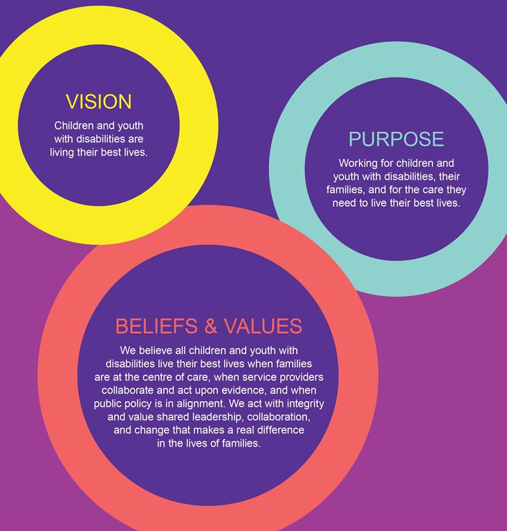
Æ
Font Size:

EKO Strategic Plan

Vision

Children and youth with disabilities and developmental differences are living their best lives.

Purpose

Working for children and youth with disabilities and developmental differences, their families, and for the care they need to live their best lives.

Beliefs and Values

We believe all children and youth with disabilities and developmental differences live their best lives when families are at the centre of care, when service providers collaborate and act upon evidence, and when public policy is in alignment. We act with integrity and value shared leadership, collaboration, and change that makes a real difference in the lives of families. 

OUR MEMBERS

Cochrane Temiskaming Children's Treatment Centre Logo
Surrey Place Logo
NEO Kids Logo
Hands The Family Help Network Logo
Pathways Health Centre for Children Logo
Logo of 'Woodview Mental Health and Autism Services'
Resources for Exceptional Children and Youth Logo
IWK's logo is a blue rounded rectangle with white figures that look like people dancing and
Bethesda's logo features the companies name in dark blue with a white bird inside a blue circle after the
THRIVE Logo
Logo of 'ErinoakKids Centre for Treatment and Development '
KidsAbility Logo
Children
CTC Logo
Logo of 'KidsInclusive | EnfantsInclus - KHSC'
firefly
Mackenzie Health Logo
George Jeffrey Children’s Centre Logo
Holland Bloorview Kids Rehabilitation Hospital Logo
Children’s Treatment Network Logo
The logo features Contact Niagara's business name in burgundy and grey lettering.
Sioux Lookout First Nations Health Authority Logo
Hamilton Health Sciences Logo
The logo turn the word
Niagara Children’s Centre Logo
Lumenus Community Services Logo
Quinte Children’s Treatment Centre Logo
Five Counties Children’s Centre Logo
Lansdowne Children’s Centre Logo
Grandview Kids Logo
TVCC logo
John McGivney Children’s Centre Logo
One Kids Place Logo
A logo with graphic design elements that reads Contact Brant, start here, your path to children's services. The text is purple, brown and green.
The Interwoven Connection logo has its name in English and French on either side of an animated thread that is looped into a square in multiple colours.
CHEO Logo